Wednesday 26 September 2012

semi final outcome


Above this two design is balance, i copy and rotate.

This i also copy and rotate but adjust a bit, make the shape and let it look more neat and clear of ''Y''.

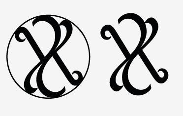
This one is balance also, i copy and rotate but join together is it look messy ?? 

The final logo u think u put the circle or no need ? i think no need ? but if put circle shape there can show my logo is that shape ? lol confuse.

Try to use red colour in my logo, but its not look nice =.= 
keep simple is better !
Red colour represent fire and blood, like energy, danger, strength, power, passion, desire and love.
I think to use red colour because my concept is freestyle, like black colour is elegant but in sometime people will feel dark, sadness then i mix with red colour can feel brave, like freestyle is not a limit things, design or else, can be very good.  Encourage people do better as you can.
but this colour i put in my logo really look weird. =.=


Monday 24 September 2012

My monogram progress 2

First 

Second using sharp beginning and ending
3rd try the thickness
color black and white , look more elegant
pink colour ? feel lovely ? 
This background look nice haha sudden change color to this lol 
orange color logo ? not really nice , but less logo is orange colour.
Orange colour will think of orange(fruit), and orange colour is like cheerful, energy, and sharp.


Thursday 20 September 2012

My Monogram progress


 Try colour (failed) =.=

Try different brush (flat brush)                                                               This is using oval brush                                             


This another curl with the beginning "y"

 The thickness of the stroke is it too thin ?  i feel flat brush better.  

Upload more on tomorrow, i want use tablet haha !                                  

Thursday 13 September 2012

my monogram design progress

This is double y design ambigram that i want to do,
decide this as my monogram.
try negative and positive
Try also Y up side down
this one add a bit curl 
This design feel like dancing.
This is k.y.y design , look funny lol like a people


Here is more clearly sketch (scan)
Brainstorming!

This is first sketches in class 

continue try to sketch and look for nice sketches


third, feel not bad haha keep moving on

more sketches


This is sketch for my monogram (identity guide)


Tuesday 11 September 2012

Research Monogram visual

abc PC boy
galeria 291, saul design
sew perfect, logo motive
Peter Ryan
Vintage monogram
Cathe Holden
Christine and Mark
Wedding Monogram design

Two J's marry into one shape, a form that represents unity. The monogram features a "W" for wedding and an ampersand to further suggest unity.

Leschiniski design
A personal logo monogram for the Leschiniski Design Studio. It is a combination of L and D in the companies name.


Reforma Athletic Club


Wild life victoria 
monogram W&V


S.A.M.N.I.U.M
this monogram i dont think is very nice , just so so . hehe

Mal de Mar

Wedding monogram


amirhossein edrisi (PHOTOGRAPHER)


Douglas Cavendish

Brain & Storm


Wright & Goebel

HN (Hollie Nicole) or MM (Micah Max)