Showing posts with label development. Show all posts

Wednesday, 31 October 2012

Finalize stationary set !

Business card

 Buisness card colours

                                                                                   front                           back


i will write something at the back.
the back use colours or just black better ?

Letterhead


Envelope


this purple colour i photoshop, i cant mix that colour lol


Badge


1. 2.    3. 4.
5. 6.    7. 8. 9.
10. 11. 12.    13. 14.
15. 16. 17.


i think 2, 4, 7, 8 or 9 ,13, 16
my background black colors is it not nice ? the grey colour better ?


Thursday, 25 October 2012

business card, letterhead !!

BUSINESS CARD

This is my main logo (grey colour)
the back i place like this.

This one is color one , the yanying and graphic design can die cut ? if die cut i make my font bold and bigger. then if change the color the words will change too , if not the words is also same is grey color is it like not very nice ? the example above this red and orange colour.

red color

green and yellow

purple and blue

which is indigo ?  these two lol


LETTER HEAD

Design 1 

Design 2
the back i put many colors of my logo or dont want ? just keep it simple ? but if add more colors more suit my design like name card also got colours?

My painting 1

Painting 2

painting 3

painting 4

How do you think ?


Tuesday, 23 October 2012

IDEA !!!

Name card
Think to print on transparent card then my logo can change colour.
and try my information change to 180'c, can turn and see.

Define the colour of my logo 
my logo with color ( primary colour, secondary colour, tertiary colour)


Lettehead idea


i do this and change my information 180'c, people can turn and see can show my logo are ambigram.

front is black colour and the main logo and easy to read with simple background. colour is the back side show my design/concept freestyle.

i think cant put pattern on it , my logo and font like not really can read.

New measurement of my logo


Research more nice design try to improve my works, not much idea for letterhead.
And feel dizzy of business card.
try design with colours ! 


Thursday, 11 October 2012

Idea for business card

1.

Think to create pattern using  the circle shape/line. because my logo is base on circle shape, using mix colour show that freestyle. and the brush painting in the idea of my freestyle so i think to use it if work.

2.
This one i think to do one set maybe have 5 or 6 colour/emotion.

3.
This one i think to die cut my logo, then show that freestyle, for who have my business card can put any background to see can get different feeling with different background. show client that i can work for them like what kind of feel they want, i can do for it ,somthing like that . haha
this one is die cut the background, like the example of my research.

4.
Think to use illustration draw the line, shape with colors feels random, flexible also like freestyle.and think to do like one set draw a picture and cilpping mask like above an example i do. 
I think write freestyle and mix with the illustration, make a pattern. Like your name card design illustration with the words.


some research of illustration.


how do you think ?  which one is most suitable ? i m confusing. And i not really know to do that illustration lol. 


my amended logo 2


Wednesday, 26 September 2012

semi final outcome


Above this two design is balance, i copy and rotate.

This i also copy and rotate but adjust a bit, make the shape and let it look more neat and clear of ''Y''.

This one is balance also, i copy and rotate but join together is it look messy ?? 

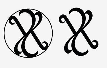
The final logo u think u put the circle or no need ? i think no need ? but if put circle shape there can show my logo is that shape ? lol confuse.

Try to use red colour in my logo, but its not look nice =.= 
keep simple is better !
Red colour represent fire and blood, like energy, danger, strength, power, passion, desire and love.
I think to use red colour because my concept is freestyle, like black colour is elegant but in sometime people will feel dark, sadness then i mix with red colour can feel brave, like freestyle is not a limit things, design or else, can be very good.  Encourage people do better as you can.
but this colour i put in my logo really look weird. =.=