Identity Guide
City of Melbourne
Previous logo
Previous identity and sub brands / initiatives
Identity System
Identity Construction
City of Melbourne is a dynamic, progressive city, internationally recognized for its diversity, innovation, sustainability, and livability. City of Melbourne council supports the city’s world-class offerings, represents it nationally and internationally, and ensures it remains a preeminent Australian center for culture, arts, dining, entertainment, education, and shopping. Since implementing its previous identity 15 years ago, City of Melbourne has experienced significant change. As a result, the council had accumulated a range of isolated logos for various services, which had become increasingly difficult and costly to manage. The fragmentation of City of Melbourne’s identity meant equity was driven away from the core brand, and the council realized that it needed a long-term solution.
City of Melbourne asked Landor to develop a cohesive brand strategy and new identity system. The challenge was to reflect City of Melbourne’s cool sophistication on the world stage, capture the passion of its people, and provide the city with a unified, flexible, and future-focused image. The new identity needed to overcome political complexities, improve the cost-effectiveness of managing the brand, and unite the disparate range of entities (including the council, City of Melbourne’s destination brand, and an ever-growing portfolio of different initiatives, programs, services, events, and activities).
City of Melbourne asked Landor to develop a cohesive brand strategy and new identity system. The challenge was to reflect City of Melbourne’s cool sophistication on the world stage, capture the passion of its people, and provide the city with a unified, flexible, and future-focused image. The new identity needed to overcome political complexities, improve the cost-effectiveness of managing the brand, and unite the disparate range of entities (including the council, City of Melbourne’s destination brand, and an ever-growing portfolio of different initiatives, programs, services, events, and activities).
We built the branding program based on the results of a thorough audit of City of Melbourne’s various identities and its long-term sustainability and strategic plans. The audit assessed public opinion and interviewed stakeholders who included local government officials, business owners, and community representatives. At the heart of the new design, the bold “M” presents a full expression of the identity system - immediately recognizable and as multifaceted as the city itself: creative, cultural, sustainable. A celebration of diversity and personal interpretation that is both future-proof and iconic.
Krista wittmann Identity
Identity design for a London based interior designer.
Krista is a young interior designer from London. Her logo is based on the first letters of her name, and it becomes a part of a parquet pattern at the same time. This pattern appears on the back side of the business cards as well. She prefers natural, vintage materials and technics in her works, so the designer made rubber stamps for her.
i like this , its nice and simple.
Mimi Identity
Identity design for a wedding & family events specialist.
Mimi is a young wedding stylist, who is interested in the manual techniques, vintage materials. My main goal was to design something really personal for her. She brought her great-grandmother's lace table-cloth, and I used it as a stencil. The front page of the business card is white screen print on recycled paper, and the back side is one big lace pattern segmented into small pieces. In this way, every piece is different.
this is great ! creative and nice.
National Muzeum in Warsaw
Logo process
Typography and colours
MNW identity
Key visual
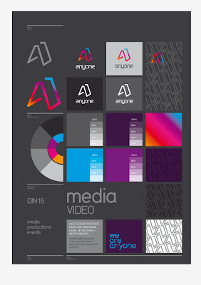
Anyone
Brand identity for anyone media production company.
I like the colour of the logo !


No comments:
Post a Comment